YouTube Banner Size: Exact Specs, Safe Zone + Design Guide (2026)
Your channel banner is the first thing a potential subscriber sees when they land on your YouTube page. Get the dimensions wrong and your channel name gets chopped off on phones, your logo blurs out on TVs, or your upload gets rejected entirely. This guide gives you the exact pixel specs, the safe zone template every creator should be using, and the design workflow that produces banners that look sharp on every screen size.
We’ll cover the YouTube banner dimensions in detail, walk through what actually displays on mobile versus desktop versus TV, give you a reference table for every YouTube channel image size, and break down design tips by channel type. By the end, you’ll know exactly how to build a banner that works.
YouTube Banner Size: The Official Specs at a Glance
Here are the YouTube banner size pixels and specs you need before opening your design tool:
| Specification | Value |
|---|---|
| Recommended upload size | 2560 x 1440 pixels |
| Minimum upload size | 2048 x 1152 pixels |
| Safe zone (text and logos) | 1546 x 423 pixels |
| Maximum file size | 6 MB |
| Supported formats | JPG, PNG, GIF, BMP |
| Aspect ratio | 16:9 |
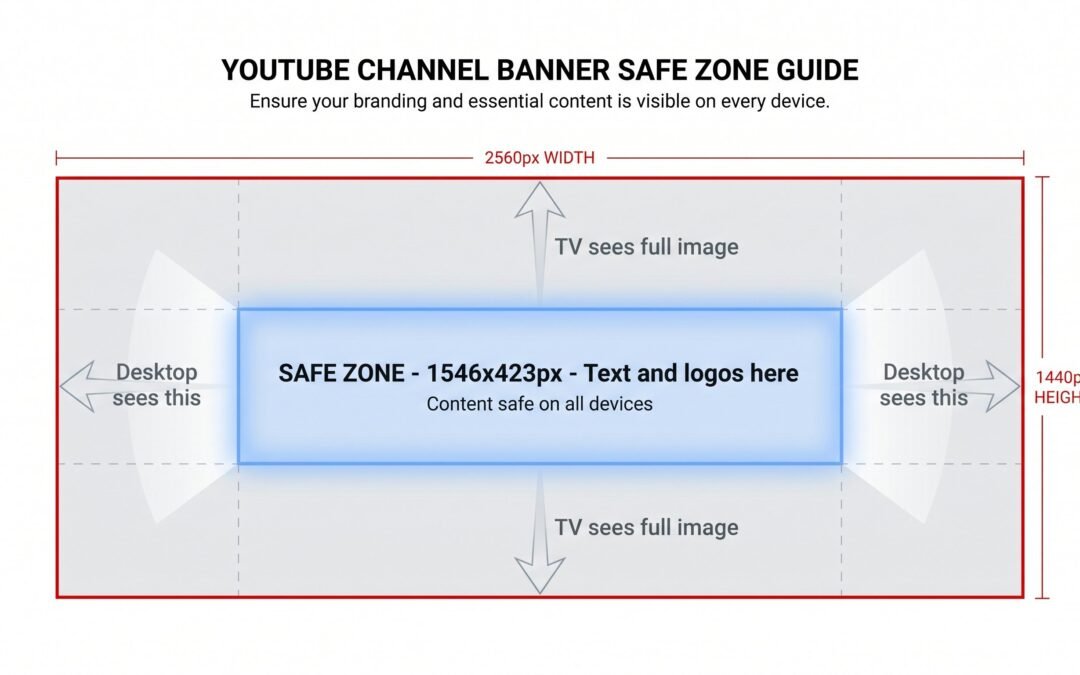
If you remember one number, make it 2560 x 1440 pixels. Upload at that size and YouTube has the data it needs to display your YouTube channel banner cleanly on every device, from a 4K television down to a phone screen. The 1546 x 423 px safe zone is the part that actually matters for design decisions, and we’ll get into why in the next section.
The Safe Zone: What It Is and Why You Actually Need It
Here’s the core insight most creators miss: your YouTube channel art does not show at the same size on every device. YouTube crops it differently depending on whether someone is watching on a TV, a desktop browser, a tablet, or a phone. The safe zone is the only part of your banner that every viewer is guaranteed to see.
The typical mistake looks like this. A creator uploads a beautiful 2560 x 1440 image with their channel name and logo placed near the top-left corner. It looks great in their design software. Then they check their channel on their phone and discover the channel name is completely cut off. Their carefully placed logo is gone. All a mobile viewer sees is the center strip of the banner, which the creator treated as background.
The safe zone is the 1546 x 423 pixel rectangle in the dead center of your 2560 x 1440 canvas. Anything inside that rectangle displays on every device. Anything outside it may or may not show up depending on how the viewer is watching.
Think of designing a YouTube banner like designing a billboard where different parts get covered depending on who’s looking at it. The center is always visible. The edges might be there, might not. Your job as a designer is to put the essentials in the always-visible area and use the edges for atmospheric design that won’t ruin the banner if it gets cropped.
If your text, logo, or key visual is outside the safe zone, some percentage of your viewers, often the majority on mobile-heavy channels, will never see it. That’s a wasted branding opportunity on the most valuable real estate on your channel page.
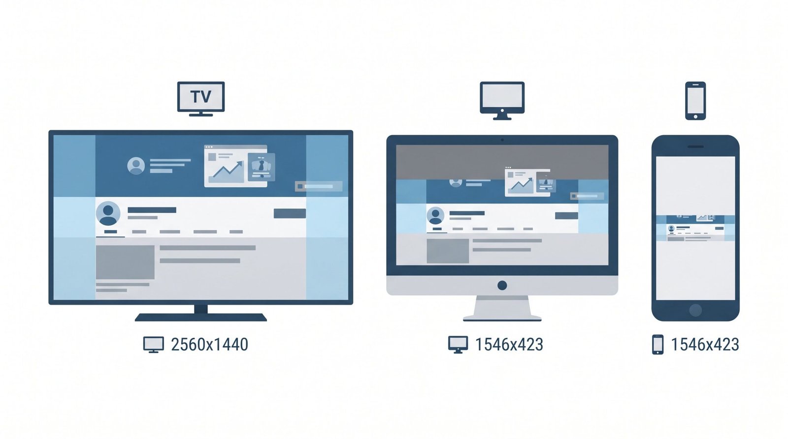
How YouTube Banners Display on Every Device
Different devices crop your banner in different ways. Here’s exactly what each one shows:
| Device | What’s visible | Notes |
|---|---|---|
| TV | Full 2560 x 1440 px | Entire image visible, edge to edge |
| Desktop | ~2560 x 423 px (cropped top/bottom) | Full width visible, top and bottom cropped |
| Tablet | ~1546 x 423 px center | Significant side cropping |
| Mobile | ~1546 x 423 px center | Most restrictive view, only the safe zone shows |
Counterintuitively, TV shows the most of your banner. Mobile shows the least. This surprises most creators, who assume desktop is the “default” experience. In practice, with mobile traffic dominating most channels’ analytics, you should design first for what mobile sees, which is just the safe zone, and then check that the full 2560 x 1440 image still looks decent for TV viewers.
The practical workflow: build everything important in the safe zone, then extend the design into the surrounding canvas with background art, gradients, or atmospheric elements that look great when visible but don’t break anything when cropped.
All YouTube Channel Image Sizes in One Place
While you’re updating your banner, you might as well update your other channel images too. Here are all the YouTube channel image dimensions in one reference table:
| Image | Recommended | Minimum | Max file | Formats |
|---|---|---|---|---|
| Channel banner | 2560 x 1440 px | 2048 x 1152 px | 6 MB | JPG, PNG, GIF, BMP |
| Profile picture | 800 x 800 px | 98 x 98 px | 4 MB | JPG, PNG, GIF |
| Video thumbnail | 1280 x 720 px | 640 x 360 px | 2 MB | JPG, GIF, PNG |
| Branding watermark | 150 x 150 px | N/A | 1 MB | JPG, PNG, GIF, BMP |
Video content and channel banners both use a 16:9 aspect ratio, while profile pictures and watermarks are square. If you’re putting work into your banner, take a few minutes to also check that your video thumbnail size guide dimensions are right for every video, and that your profile picture isn’t blurry from being uploaded at too small a resolution. Consistent branding across all four image types makes a channel look professional at a glance.
For more on building out your channel beyond just visuals, our guide on how to write a strong channel description pairs well with banner design as a one-two punch for first-impression branding.
File Format and Size: What Actually Matters
You have four format options for your banner: JPG, PNG, GIF, and BMP. In practice, you only need two of them.
JPG works best for photographic banners. If your banner features a real photo, lifestyle imagery, or anything with smooth color gradients, JPG gives you near-identical visual quality at a much smaller file size than PNG. Export at quality 90-95 for the best balance.
PNG is the right choice for banners with text, logos, sharp graphics, or flat-color designs. PNG preserves crisp edges without the compression artifacts that JPG can introduce around lettering. The file size will be larger, but you’re well under the 6 MB limit unless your design is extremely complex.
GIF is technically supported, but here’s the catch: YouTube banners do not animate. Even if you upload a multi-frame GIF, it displays as a still image. Don’t waste time animating a banner GIF, it won’t work.
BMP is supported but offers no real benefit over PNG. Skip it.
The 6 MB file size limit almost never causes problems at normal export settings. If you’re exporting a banner from Photoshop or Illustrator at maximum quality and somehow exceeding 6 MB, drop the JPG quality to 90 or switch to PNG-8 if you have flat colors. Resolution is another non-issue: 72 DPI is the screen standard. Exporting at 300 DPI just bloats the file size with no visual benefit, because YouTube is going to display it on screens, not print it.
How to Design Your Banner Using the Safe Zone
Once you understand the safe zone, the actual design workflow is straightforward. Here are the five steps:
- Start with a 2560 x 1440 px canvas. Always work at the full upload size, never scale up from something smaller.
- Add a centered guide or overlay at 1546 x 423 px to mark the safe zone. This is your “always visible” area.
- Place all text, logo, and key visuals inside the safe zone. Channel name, tagline, call to action, anything you need every viewer to see.
- Use the surrounding area for background design. Atmospheric elements, gradients, patterns, photographic backgrounds that look great when visible but won’t hurt the design if cropped.
- Export and upload. PNG for text-heavy banners, JPG for photographic ones.
If you want to streamline how you handle channel branding alongside keyword research and channel analytics, dedicated YouTube SEO tools like TubeBuddy and vidIQ include banner templates and channel optimization checks. For the design work itself, here’s how to set up the safe zone in the three most common tools:
In Canva
Canva includes a “YouTube Channel Art” template preset at 2560 x 1440 pixels. When you select the template, Canva displays a safe zone guide overlay so you can see exactly where the always-visible area sits. Drop your text and logo inside the safe zone, then use the wider canvas for background imagery.
One practical tip: don’t push critical elements right to the edges of the safe zone. Leave a 40 to 50 pixel buffer inside the safe zone borders so nothing important sits flush against the crop line. YouTube’s display sometimes has minor variation around the safe zone boundaries.
In Photoshop or Illustrator
Create a new document at 2560 x 1440 pixels, 72 DPI, RGB color mode. Add View > Guides at the center to mark out a 1546 x 423 pixel safe zone rectangle. Calculate the offsets: the safe zone starts at x=507, y=508 and extends to x=2053, y=931.
Or skip the manual setup and grab the free YouTube banner template directly from Google. YouTube’s official banner guidelines include a downloadable PSD template with the safe zone already marked, which is the fastest way to get started.
Lock the background layer, design over it, and export as PNG for crisp text or JPG for photographic content.
In Figma
Create a 2560 x 1440 frame. Inside it, add a centered 1546 x 423 rectangle and label it “Safe Zone.” Lock that rectangle and use it as a visual reference. Auto-layout and constraints work well here because you can keep critical elements centered as you iterate.
Figma’s export options handle PNG and JPG cleanly at 1x, which produces the correct pixel dimensions for a 2560 x 1440 frame.
Common YouTube Banner Mistakes (and How to Fix Them)
Most banner problems trace back to a handful of recurring mistakes. Here are the six most common ones and how to diagnose and fix each:
- Blurry or pixelated banner. Cause: uploaded below the minimum resolution or scaled up from a small source file. Fix: always start your design at 2560 x 1440 pixels. Never upscale a 1280 x 720 image, you’ll just get a soft, fuzzy result. If you only have a small source image, find a higher resolution version or rebuild the design at the correct size.
- Text cut off on mobile. Cause: text or logo placed outside the 1546 x 423 px safe zone. Fix: open your design file, add a safe zone guide if you don’t have one, and reposition all text to sit comfortably inside that center rectangle.
- Banner looks fine on desktop but terrible on TV. Cause: designed only with the center strip in mind without thinking about what the full 2560 x 1440 image looks like. The surrounding area might be empty, awkwardly cropped from a photo, or visually mismatched. Fix: review the full canvas, not just the safe zone. Make sure the area beyond the safe zone is intentional design, not leftover space.
- Wrong proportions. Cause: uploaded a non-16:9 image, like a square or vertical photo. Fix: always use exactly 2560 x 1440 as your canvas size. YouTube will accept other ratios but distort or crop them weirdly.
- Too much going on. Cause: cramming logo, channel name, tagline, social handles, upload schedule, and decorative art all into the safe zone. Fix: pick one or two focal elements. The banner is branding, not a business card. A clean banner with just the channel name and a tagline outperforms a cluttered one almost every time.
- Low-contrast text. Cause: white text on a light background, or dark text on a dark photo. Fix: add a semi-transparent overlay (a dark rectangle at 40-60% opacity) behind the text inside the safe zone. This gives you instant readability without redesigning the whole background.
Banner Design Tips by Channel Type
The same dimensions apply to every channel, but the design approach should match what the channel is about. Here’s how to think about it for each major category:
Gaming Channels
Dark backgrounds with vibrant accent colors (cyan, neon green, electric blue, hot pink) read well on TVs and large screens. Place the channel name and game genre or tagline in the safe zone, then use the surrounding canvas for character art, gameplay stills, or atmospheric environment shots.
Avoid cluttered collages stuffed with twelve different game logos. One focal image, like a single character or a dramatic environment, outperforms multi-game collages for branding clarity. Viewers should know within half a second what your channel is about.
Vlog/Lifestyle Channels
A personal photo or lifestyle image with a clean text overlay works well for this category. Warm color palettes (golden hour, soft pastels, earthy tones) tend to resonate with vlog audiences. Use a gradient text background or a semi-transparent panel behind your channel name to maintain legibility over a busy photo.
The channel tagline goes in the safe zone. A full-bleed photo can extend across the whole canvas, with the focal subject (you, your face, a lifestyle setting) positioned so it’s visible even when cropped on mobile.
Business/Brand Channels
Brand logo and tagline centered in the safe zone, brand colors in the background, restraint everywhere else. A business channel banner is a trust signal, not a showcase. Visitors land on the channel and need to know within a glance that this is a legitimate, professional entity.
Keep it clean. White space is your friend. If your brand has an established style guide, follow it for the banner the same way you would for any other brand surface.
Tutorial/Educational Channels
Make the channel topic absolutely clear. “Python Tutorials for Beginners” or “Watercolor Painting for Hobbyists” tells a viewer exactly what they’ll get. Put that statement directly in the safe zone.
Use clean, high-contrast design. The banner shows on the channel page exactly when a new subscriber is deciding whether to subscribe. Make that decision easy. Icons, infographic-style elements, or a clear visual theme that matches your tutorial content (a code snippet, a brush stroke, a math symbol) reinforces what the channel teaches.
Music Channels
Artist photo or album art in the surrounding canvas area, band name or stage name prominently in the safe zone. Less text, more visual identity. The banner should feel like an album cover detail blown up to channel scale.
For solo artists, a strong portrait shot works well. For bands, a group photo can occupy the full canvas with the band name overlaid in the safe zone. Match the color and mood of the banner to the music itself, a synthwave artist’s banner shouldn’t look like a folk singer’s.
FAQ
What is the correct YouTube banner size in 2026?
The recommended YouTube banner size is 2560 x 1440 pixels at a 16:9 aspect ratio with a maximum file size of 6 MB. The safe zone, the center area guaranteed visible on all devices, is 1546 x 423 pixels.
What is the YouTube banner safe zone?
The safe zone is the 1546 x 423 pixel center rectangle of your banner. Any element placed outside this area risks being cropped on mobile and tablet devices. Keep all text, logos, and key visuals within this zone.
What is the minimum YouTube banner size I can upload?
YouTube requires a minimum of 2048 x 1152 pixels. Anything below this will be rejected at upload. We suggest uploading at the full recommended size of 2560 x 1440 pixels for the best display quality across all devices.
Does YouTube channel art have to be exactly 2560 x 1440?
No, but 2560 x 1440 is the recommended maximum. YouTube accepts anything from 2048 x 1152 pixels (minimum) up to 2560 x 1440. Uploading at the full recommended size gives YouTube the most flexibility to display your banner well on large screens including TVs.
What file format should I use for my YouTube banner?
PNG is best for banners with text, logos, or flat design because it preserves sharp edges without compression artifacts. JPG works well for photographic banners (smaller file size, near-identical quality). GIF is supported but not animated in banners, it displays as a still image.
Can I use an animated GIF as a YouTube banner?
YouTube accepts GIF files as channel banners, but they will not animate. The banner displays as a static image regardless of whether the GIF file contains multiple frames.
Why does my YouTube banner look different on my phone than on my computer?
Because YouTube crops the banner differently by device. On desktop, you see roughly the full-width but center-height crop. On mobile and tablet, only the center 1546 x 423 pixels are visible. This is why the safe zone matters: if your text or logo is outside that center area, mobile users won’t see it. For more details on managing all aspects of your channel’s appearance, see Manage your channel branding in Google’s help center.